Getting started
Now that you have a Checkout extensions project in your monorepo, let’s create your first extension. After creating the project, you’ll already have a sample extension set up. To better understand how it works, let’s go through the files inside the project folder step by step.
1. Entrypoint
The first file to take a look at is the src/index.tsx file located at the root of your project. This is the entry point for all extensions
you’ll create for Checkout. When you create your project, it will look like this:
import { defineExtensions } from '@vtex/checkout';import { HelloWorld } from './HelloWorld';
export default defineExtensions({  'cart.cart-list.after': HelloWorld,});
What we need to focus on here is:
- The
defineExtensionsfunction is responsible for linking the extensions you’ve created to the target extension point. - You can create extensions in other files and import them into
index.tsx. - Using
defineExtensionshelps you understand which extension points are available through type-checking and autocomplete, but it’s also required for your extensions to work properly. - The
@vtex/checkoutpackage, installed in your monorepo during the setup process, provides everything you need to build your extension, including hooks, types, and functions.
2. The extension itself
When you create the project, you’ll find a sample extension in the src/HelloWorld.tsx folder. This extension consists of two files:
a TypeScript file for the implementation and a CSS file for styling. However, not every extension file requires a stylesheet—this is just an
example of what’s possible. You can organize your style and implementation files however you prefer, creating multiple files or combining them
into one.
import { useState } from 'react';import './hello-world.css';
export const HelloWorld = () => {  const [count, setCount] = useState(0);
  return (    <button className="hello-world-btn" onClick={() => setCount(count + 1)}>      Count: {count}    </button>  );};
What we can take away from this example is:
- Extensions are simply React components, and they can use any React feature just like any other React application would, such as hooks
like
useEffect,useState, etc. - Extensions can import CSS files, allowing you to include the created classes and make them globally accessible.
Creating your first extension
Now that you’re familiar with the essential parts of an extension and how the project structure works, let’s go ahead and create your first extension. For this, we’ll use the example created in the Setting Up step, with the sample folders and accounts. You’re probably using a different account name and folder name, so don’t forget to change these parameters to your specific names, like the folder name and store/account name, to ensure everything works as expected.
1. Running the Checkout extensions project
Before we start the implementation, let’s set up the development environment by running the dev command from the FastStore CLI:
yarn fsp dev store-anpx fsp dev store-aWith that, you should receive the store’s URL as output in your terminal, and the Checkout will be accessible at the /checkout/cart path.
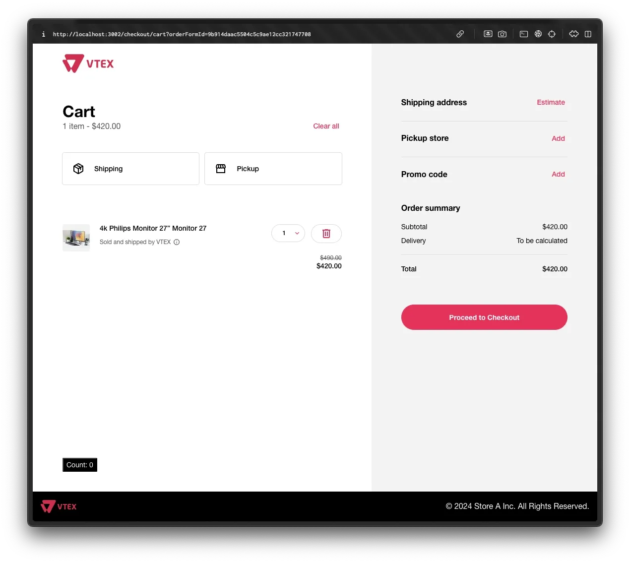
When you open it, you should see the following screen:
2. Creating the component
As mentioned earlier, extensions in FastStore are simply React components. With that said, one way to create our first extension is by creating a TypeScript file with the implementation:
Directorystore-a/
Directorycheckout/
Directorysrc/
- index.tsx
- HelloWorld.tsx
- hello-world.css
- CustomFooter.tsx
- package.json
- …
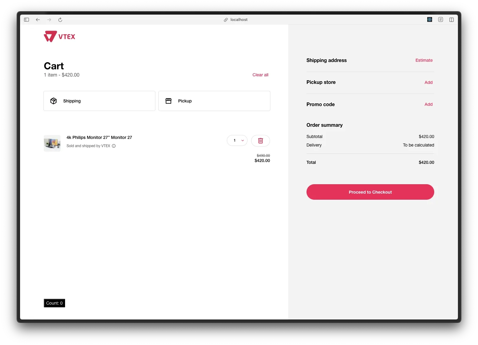
Let’s create a custom footer for Checkout. You can add the following content to CustomFooter.tsx:
export const CustomFooter = () => { return ( <footer> <p> © 2024 Store A Inc. All Rights Reserved. </p> </footer> )}Now, let’s connect this extension to an extension point by modifying our src/index.tsx file to the following:
import { defineExtensions } from '@vtex/checkout';import { HelloWorld } from './HelloWorld';import { CustomFooter } from './CustomFooter';
export default defineExtensions({  'cart.cart-list.after': HelloWorld,  'layout.footer': CustomFooter,});
After that, save your file, open your browser with the Storefront running, and you should see the extension rendered at the bottom of the cart page:
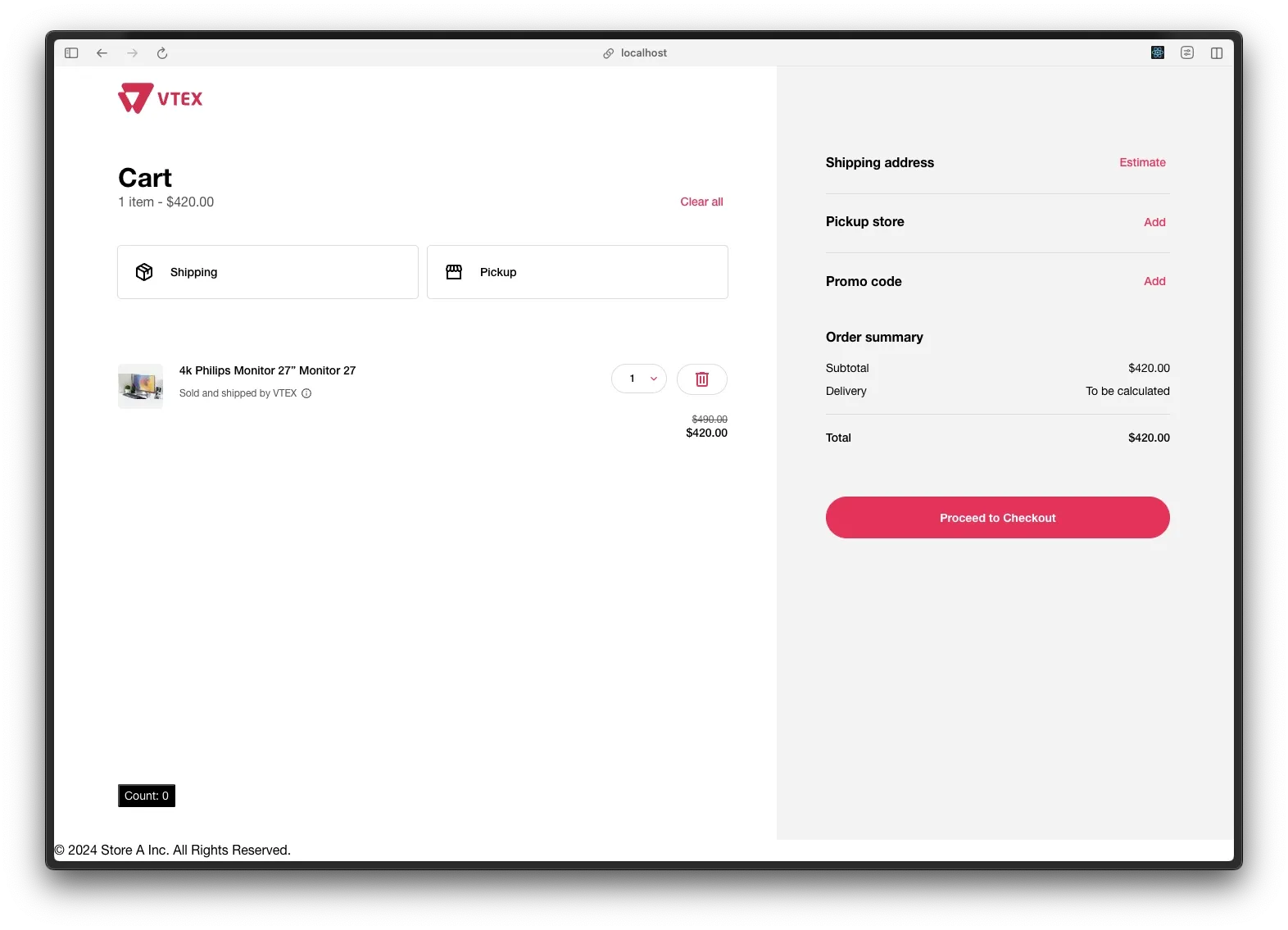
3. Adding the logo
Let’s add the logo used in Checkout to our Footer component. To do this, we’ll use the useSettings hook provided by the @vtex/checkout package. In our src/CustomFooter.tsx file:
import { useSettings } from "@vtex/checkout"
export const CustomFooter = () => {  const { branding } = useSettings()  return (    <footer>      <img width={72} src={branding.logo} />      <p>        © 2024 Store A Inc. All Rights Reserved.      </p>    </footer>  )}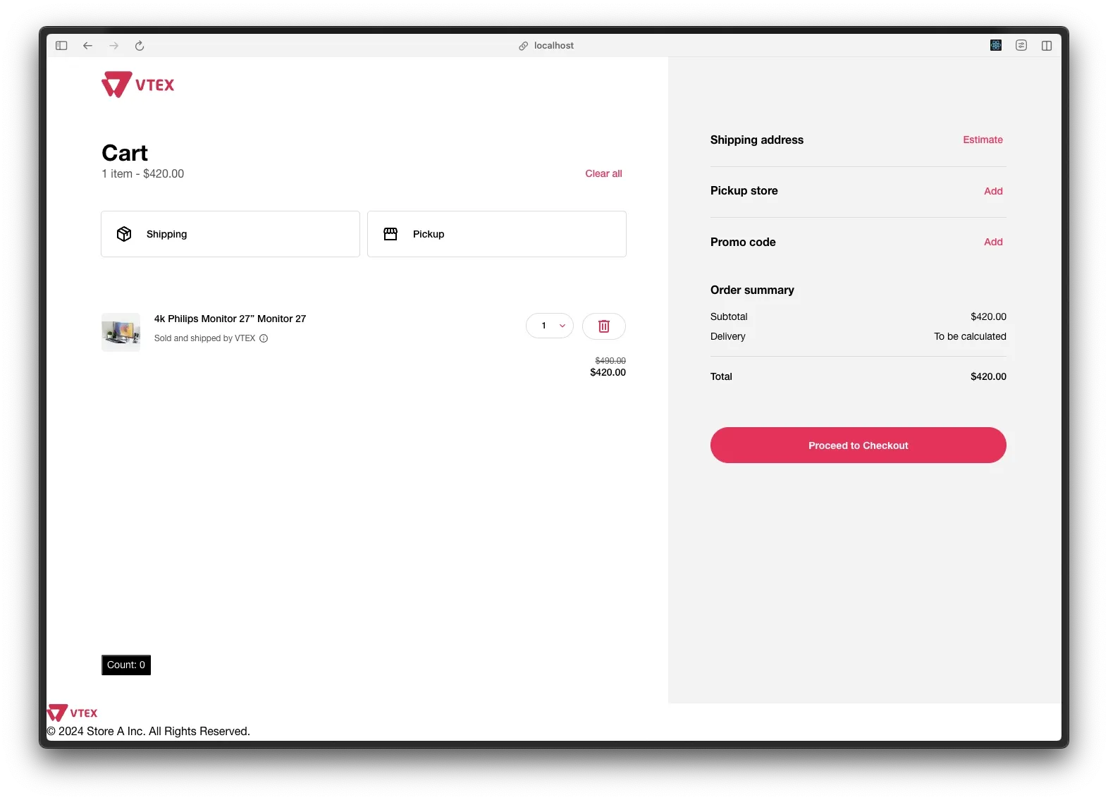
4. Styling with CSS
Now, to style our CustomFooter, let’s create a .css file in the same folder where we placed our component, src/:
.custom-footer { width: 100%; display: flex; justify-content: space-between; align-items: center; background: #000; padding: 16px; color: #fafafa;}Let’s apply our CSS class to the CustomFooter:
import { useSettings } from "@vtex/checkout"import './footer.css'
export const CustomFooter = () => {  const { branding } = useSettings()  return (    <footer className='custom-footer'>      <img width={200} src={branding.logo} />      <p>        © 2024 Store A Inc. All Rights Reserved.      </p>    </footer>  )}
Now, switch to your browser with the application open, and tada 🎉—you’ve done it! You just created your first extension for Checkout: